12 Event Landing Page Examples to Promote an Event
There’s one thing all of us snöballers have in common: we love to see impactful, simple, highly-converting event landing pages. In this article, we’ve assembled 12 event landing page examples that perform. If you’re not sure what an event landing page is, we covered the topic in detail in a previous post. In a nutshell, it’s a web page that’s specifically designed to give prospective event attendees all the info they need to commit to registering for your meeting.
Your main event landing page could be your home page, but it doesn’t have to end there. You could have several landing pages tailored to different advertising campaigns and audience personas. Using snöball, you could even design a unique landing page for every one of your participants and capitalize on peer-to-peer marketing.
Get inspired by these 12 impactful event landing page examples from some of the top conferences in a variety of industries. The forecast for the end of this article: a flurry of inspiration!
Event landing page examples:
Martech Conferences
1. Web Summit
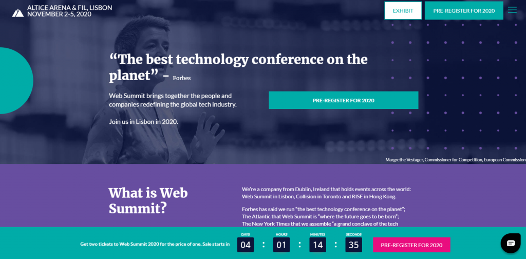
What we love: The first thing we notice is the distinctive colour palette in the Web Summit branding, which makes their landing page pop. They also use call-to-action buttons very well. There are four visible buttons on this page, and three of them direct to pre-registration. This landing page features many compelling reasons to attend the event, and no distracting outbound links. There are other sections to this website, but they are hidden in the hamburger menu on the top-right. Smart. The sale countdown is also a nice touch since it creates urgency while highlighting a high-value offer. Finally, the chatbot on the bottom right provides on-demand attendee support, adding the cherry on top of this ideal event landing page example.
2. INBOUND 2020
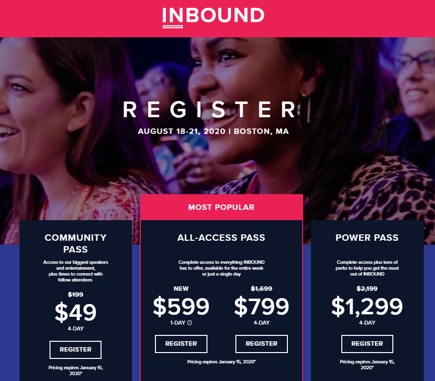
What we love: Sometimes your event’s pricing structure can become confusing. Registrants need a clear-cut way to visualize and understand the best option for them. A tried-and-true method for simplifying this is by creating pricing tiers as INBOUND has done in the pictured example. Lay out the specifics of each package/option in bullet form, and mark one of the packages “featured” or “most popular”. There are plenty of ways to improve your pricing page based on consumer psychology, including incorporating an FAQ page to make selecting a package easier, and making colour choices that reduce registrant friction.
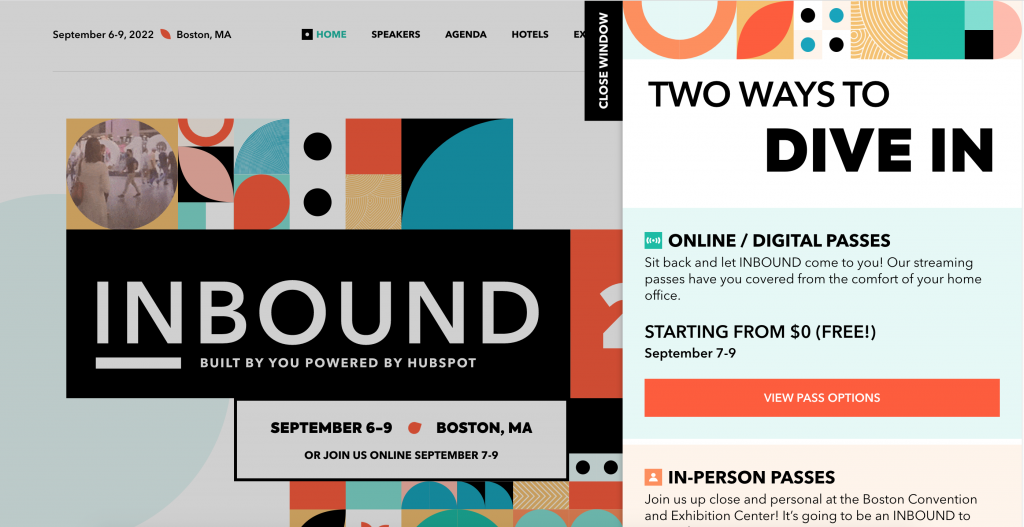
In a recent update to INBOUND 2022 Website, we can see how the pricing tab is conveniently positioned to slide in and out to display pricing. An additional consideration in the recent COVID-19 pandemic time is the need to differentiate the In-person vs the Online ticketing options available to potential attendees.
3. PCMA Convening Leaders
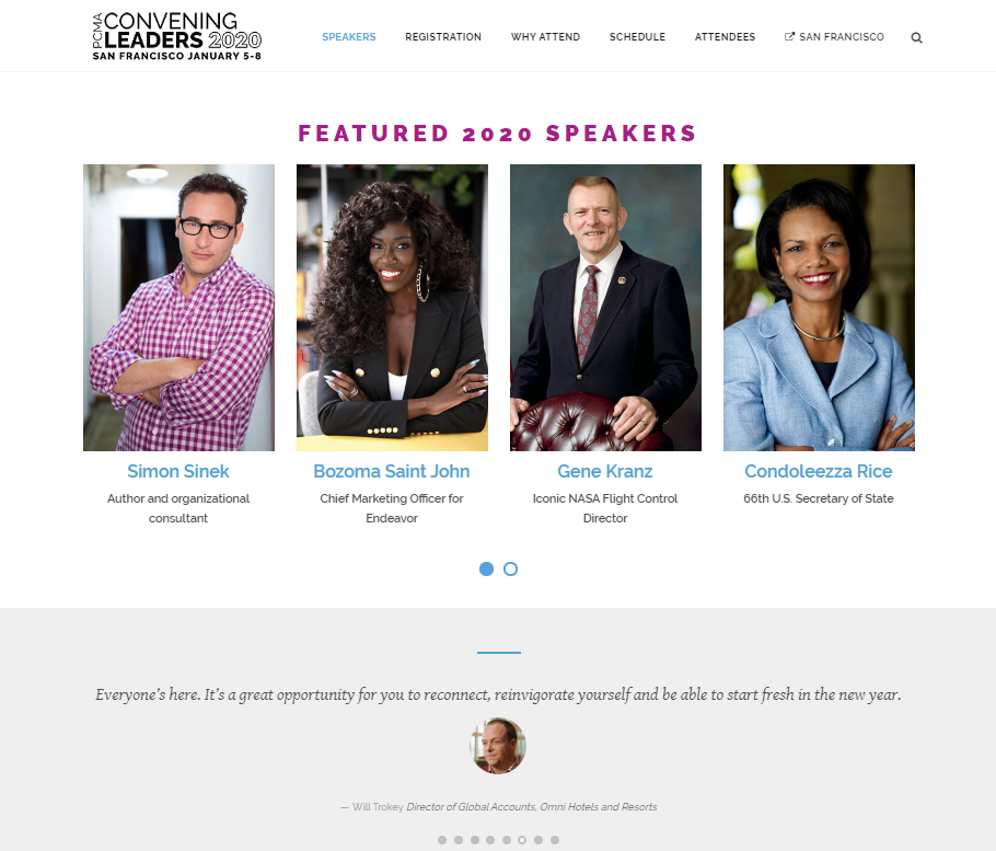
What we love: Below a punchy header image and a few key points, there is a content block that puts the most notable event speakers front-and-centre. Speakers are at the heart of any event and offer some of the most compelling reasons to attend. Also shown here is a “social proof” carousel. Social proof content is another essential event landing page element. The “proof” comes in the form of testimonials from past participants, in this case.
4. Content Marketing World
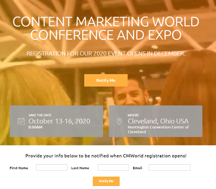
What we love: Landing pages can actively work for you during the entire event life cycle. Content Marketing World demonstrates this by having a prominent “notify me” box and sign-up section on their landing page while registration is not yet open. Lead collection mechanisms like this allow you to keep relationships going with prospects at any time.
5. Event landing page examples: our client
CIMBC20
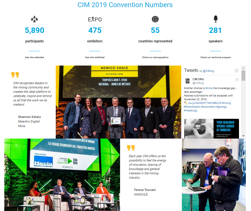
What we love: The majority of associations with annual events need to find new ways to demonstrate clear value to prospective participants. For our client, the Canadian Institute of Mining, Metallurgy, and Petroleum, this value is demonstrated through a dynamic website. “By the numbers” provides a lot of info at a glance, with links for more info directly below. For social proof: photos, quotes, and a live Twitter feed are concisely displayed.
6. Connect Marketplace
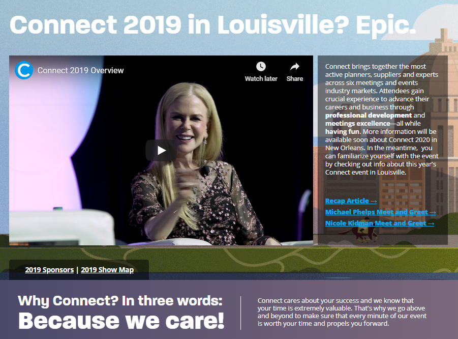
What we love: Displaying a video front-and-centre is an excellent way to say more with fewer words and clutter. This is also a good example of a landing page that offers a retrospective on an event that has just wrapped up, with quick access to recap articles and other content.
Related: we partnered with Connect to snöball Connect Marketplace.
7. ESOT
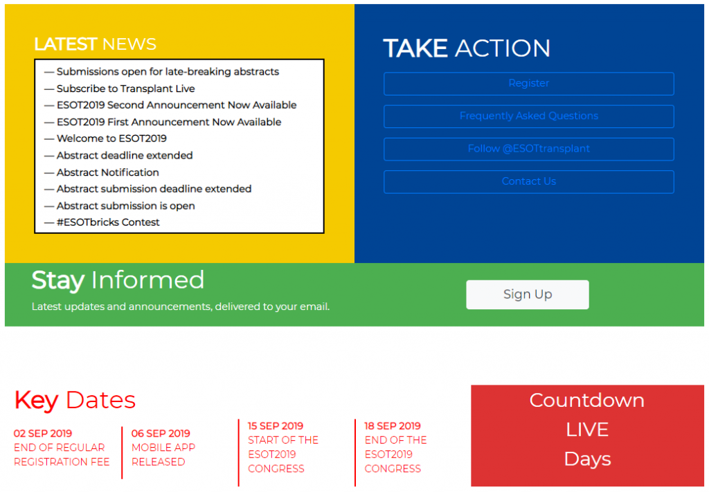
What we love: ESOT managed to condense a lot of information into a grid that is easy on the eyes. Those looking to stay current with the latest news can look to the dynamic news box. The take action box is as clear as can be. Other info is equally concise.
8. Hive Conference
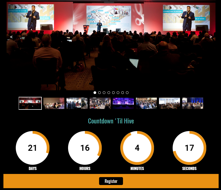
What we love: The scrolling photo gallery is elegant, and the animated countdown brings a sense of excitement towards the launch of the meeting. The registration button stands out as it should.
9. Snöball landing pages
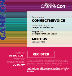
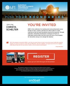
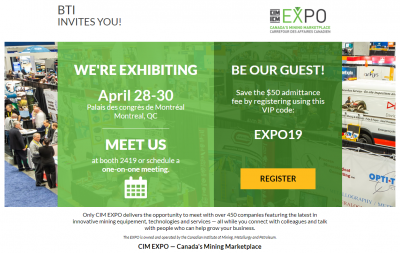
These highly personalized landing pages were generated by Snöball, and shared with every speaker, exhibitor, and other participants of a great variety of events. Snöball influencer landing pages are stand-alone, trackable web pages that expand the event’s reach and audience. They are free of distracting content and designed to drive connections, conversations, and conversions. Speakers get to spread the word about the research they are presenting, while exhibitors can promote their presence start networking well in advance of the show. All participants, even delegates, can use their custom landing page to personally invite people in their network.
Bottom Line
We hope this post provided you with some killer inspiration for your next event landing page. Your event website can truly be a sales machine, provided you keep your landing page clean and free of buttons that take attention away from registration. Also remember to keep your pricing tiers crystal clear, and feature engaging content year-round.
To take your event landing pages to a whole other level, give snöball a try. You’ll receive ready-made, custom landing pages for every one of your event participants, thereby increasing your attendance goal exponentially!

