Before someone ever registers for your event, they’ve likely clicked through from somewhere — an email, a LinkedIn post, a peer share, a WhatsApp message, or even a Facebook post.
Whatever the channel, the destination is usually the same: your landing page.That page is often their first meaningful interaction with your event — where curiosity turns into consideration.
But here’s the kicker: most event landing pages convert at just around 5%.
Let’s fix that. This article discussed 9 must-haves to help turn that interest into confirmed registrations. But let’s first dig deeper why these pages fail to convert:
Reasons for low conversions of event landing pages
| Weak headline | Cluttered layout | Slow loading time | Lack of clear CTA | Unclear audience fit |
| Generic messaging | No social proof | Poor mobile experience | Too many form fields | No urgency or FOMO |
That means potential attendees visit these pages but leave without signing up – not because they’re not interested, but because the page didn’t convince them.
For instance, some websites are created keeping in mind the recurring event attendees.
But what about the first-timers?
They need clarity on what the event is about, who it’s for, who they’ll meet, and how it benefits them.
Throwing big numbers like “5,000 attendees” or “200 speakers” doesn’t answer the real question every new visitor has: What’s in it for me?
That’s what your event landing page needs to address.
Nicola Wartnaby, Group Marketing Director at Terrapinn says:
“You can drive the perfect audience to your site.
But if the landing page doesn’t convert? The campaign fails.You don’t need to be a web designer or analytics wizard.
“You just need to focus on what happens after the click.
“Because what happens after the click often matters more than what happens before.”
Smart event marketers ensure their landing pages are clear, compelling and easy to act on. Fixing the key elements of the page is a crucial part of that.
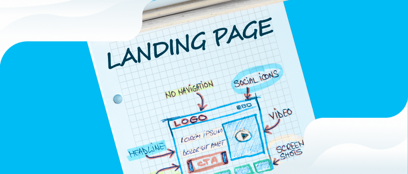
To increase conversion (confirmed registrations) on your event landing page, we will focus on these nine must-have elements:
- A benefit-driven headline
- Clear event details (date, time, location)
- Visuals and video that sell the experience
- An emotionally-driven call-to-action (CTA)
- Social proof from attendees and speakers
- A clear, compelling value proposition
- Built-in social sharing tools
- Fast, mobile-first performance
- Trust-building security elements
Each element removes friction and helps turn clicks into confirmed registrations.
1. What makes a great event landing page headline?
- Lead with the benefit to your entire audience. That means new and returning attendees, exhibitors and sponsors. Keep the headline plus tagline under 20 words so even mobile scrollers grasp the value instantly.
- Respect the F-pattern. Place logo → headline → CTA → date in the exact order eyes scan (left-to-right, top-to-bottom) to remove friction.
- Add micro-proof. A line like “5,200 joined us last year” beside the CTA leverages social validation.
Why it matters: Visitors decide in seconds, and pages that surface a clear benefit plus a proof cue near the fold convert significantly better than those that do not.
For example, look at this C2 landing page:
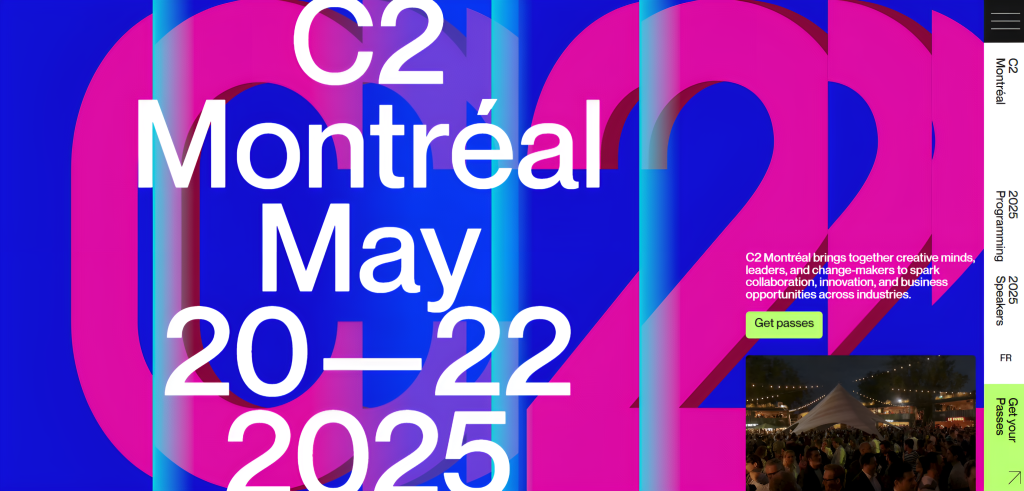
The date and location are mentioned prominently. And just above the CTA, you can see who the event is meant for.
Or look at this landing page of Hubspot’s INBOUND 2025
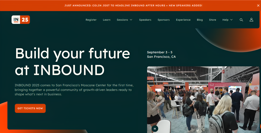
Can you see the distinctive F pattern?
2. What key info should go above the fold?
Pin the date, time, and venue at the very top. These should be above the fold – period.
- For hybrid shows, embed a simple time-zone converter so global prospects do not need to do math.
- Geo-tag the venue and add a Google Maps one-click link; visitors who can picture the journey are more likely to complete the form.
- Separate the sign-up flows for attendees from those of exhibitors or sponsors to avoid form fatigue. Different goals, different forms, zero friction.
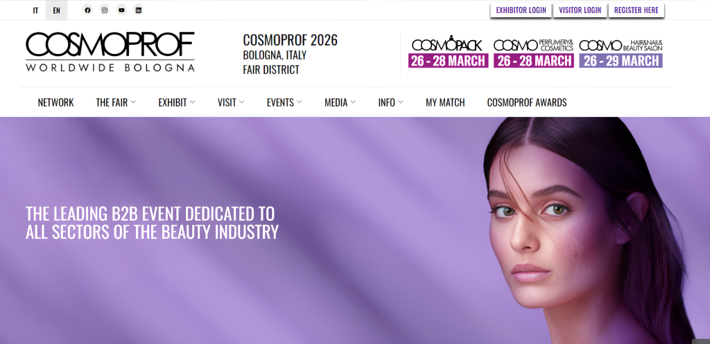
A page that answers the “When? Where? How much?” questions in five seconds moves people in the funnel faster, e.g, the below landing page of Cosmoprof 2025.
3. Why are visuals and video so important?
The visuals should pre-sell the experience. If text speaks to the brain, video speaks to emotions.
Research shows that video clips can boost conversions by 86% when compared with static imagery.
Featuring video testimonials from past attendees explaining why they return is a powerful way to speak directly to potential visitors and build trust.
Similarly, giving speakers dedicated landing pages where they can invite people to their sessions through short teaser clips can significantly boost sign-ups.
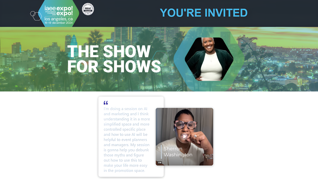
Below you can see how IAEE’s Expo! Expo! 2025 have incorporated a speaker video on their landing page
Some best practices to follow:
- Lazy-load videos to prevent slow page loads, especially on mobile.
- Use an eye-catching thumbnail (poster frame) that hints at the value of the video—think smiling faces, action shots, or bold text overlays.
- Compress all hero visuals (videos and images) to under 150 KB using modern formats like WebP or MP4 to ensure fast performance.
- Add captions to every video to make them accessible and scannable.
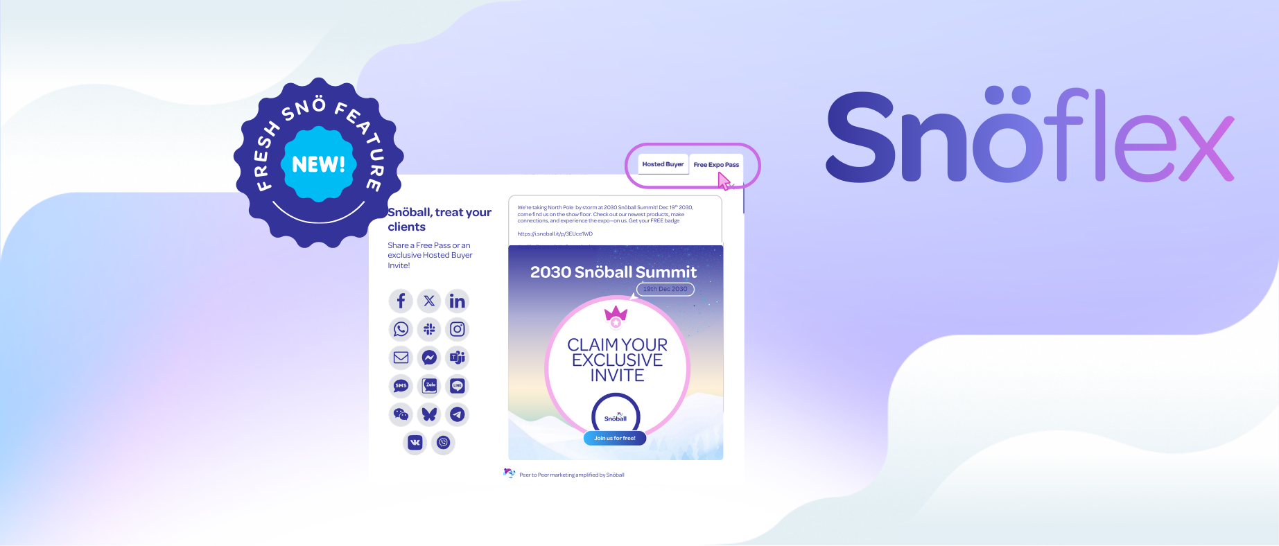
- Use tools like Snöball to easily integrate such video testimonials and invite tools to your landing pages.
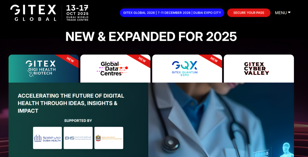
Consider adding a section titled “What’s New This Year” to your event landing page. This helps returning attendees quickly spot new additions, updates, or expanded features, especially those who might be undecided about attending again. Highlighting what’s fresh gives them a reason to come back.
E.g. the GITEX Global 2025 landing page features a bold “New & Expanded for 2025” headline, drawing attention to newly added zones and focus areas.
4. How do you write a CTA that actually converts?
- Color contrast: Pick an accent shade that appears nowhere else on the page.
- Copy with emotion: “Save my seat” or “Unlock my pass” beats a bland “Register now.” Make the sign-up feel like a reward. Behavioral marketing expert Nancy Harhut recommends more such psychological CTA hacks here.
- Urgency triggers: Using countdown timers, limited-seats, early bird incentives or price increase deadlines can drive conversion lifts of up to 332 percent%
- One page, one goal: Brands that stripped extra buttons and kept a single focal CTA saw up to a 3.7X increase in sign-ups.
Run two CTAs in an A/B test: one emotional (“Save my seat”), one practical (“Unlock my pass”). Your data will tell you what to do.
5. What kind of social proof works for events?
Nothing builds trust in your event more effectively than social proof from real people who are experiencing it firsthand.
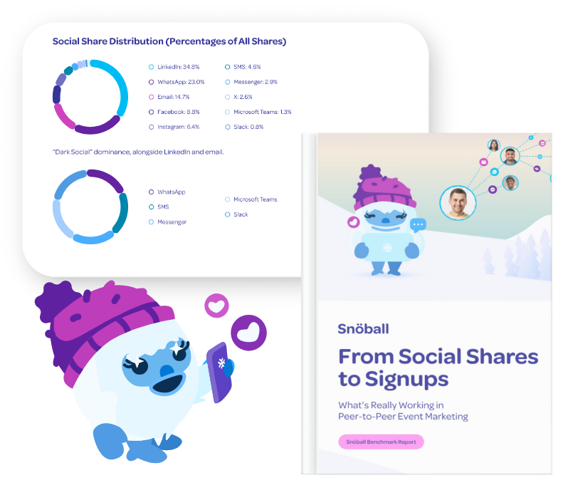
Research from Snöball’s Peer-to-Peer Event Marketing Benchmark report shows that mobilizing your audience (attendees, speakers, exhibitors, sponsors) through peer referrals can boost your event’s visibility by 51% and drive conversions rates (sign-ups) of 31.7%
Social proof plays a powerful role in building trust and excitement around your event.
It could be something as simple as a LinkedIn post from an attendee announcing they’re going, or a speaker sharing a short video teaser that feels like a personal invitation to their session.
Another powerful way to amplify this is by using a Social Wall that’s embedded directly on your event landing page. Such a Social Wall pulls together all the online buzz, posts, and mentions about your event into one dynamic display.
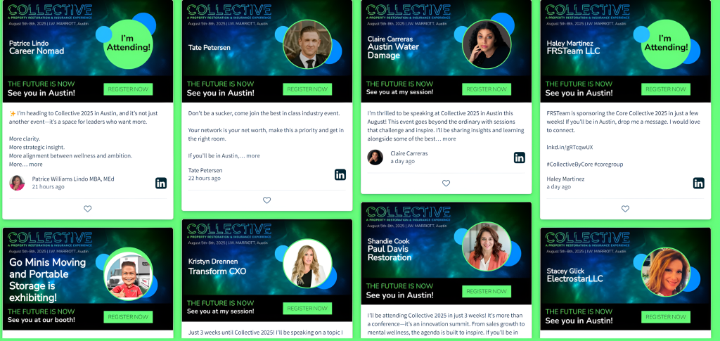
Think of it as a digital town square where your community’s voices come together in real time. It not only showcases engagement but also encourages more people to join the conversation, bringing your event to life right on the landing page.
6. How do you clearly communicate event value?
When people sign up, they buy access, insight, and community, not entry badges.
- High-profile speakers (e.g. “Hear live from Google’s Head of AI Ethics”)
- Exclusive workshops ($5000 in masterclass value included in every pass)
- VIP networking (Meet 200-decision makers during our C-suite dinner)
Price framing helps: list the premium pass first so lower tiers feel like a savvy deal.
For example, when pages bundle an explicit dollar value beside each perk ($250 of masterclasses included”), cart-value climbs significantly because visitors can quantify the offer.
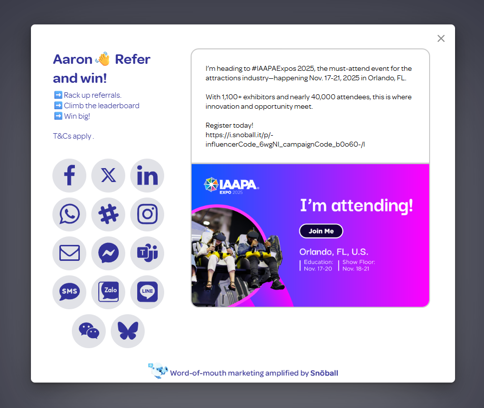
7. When (and how) should attendees be asked to share?
When someone registers for your event, that’s the perfect moment to encourage them to spread the word.
Social sharing expands your event’s visibility by turning attendees into promoters.
Attendees and exhibitors can express their excitement by sharing their participation on social media and encouraging their network to join them.
Speakers can take it a notch further by using built-in video invitation tools on their landing pages and share personalized invites, driving more interest and sign-ups through a personal touch.
People are more likely to trust and join events when they see someone they know already involved.
Note: It’s important to make messages more personalized so they sound more credible and the trust factor shoots up.
A social amplification tool like Snöball provides customized landing pages and a social share kit for each registrant. This helps boots your event’s outreach, engages their network, and help your event grow without extra ad spend or manual outreach.
8. How important is mobile performance?
Top-converting pages treat mobile as primary traffic, not an afterthought. According to Swoogo, 78% of event registration pages are optimized for mobile devices in 2024. This underscores the market’s focus on mobile usability. Here are more revealing stats:
- Sites that are mobile‑optimized see a 160% lift in conversion rates — meaning mobile-friendly pages deliver dramatically better performance.
- 53% of visitors abandon a mobile page that loads in over three seconds.
What you can do?
Aim for <2 second load times, 48 px buttons, and font sizes no smaller than 16 px.
Compress hero images below 150 KB and you not only shave seconds off load time but also save ad dollars by improving Quality Score on mobile search.
9. What builds trust at the point of registration?
People won’t share personal or payment details unless they feel completely safe. At the moment of registration, trust signals are not decorative. They are decision drivers.
Beyond generic SSL locks, high-performing event landing pages layer multiple reassurance cues:
Security and compliance badges
SOC 2 Type II – Signals that your systems, access controls, and data handling have been independently audited over time. Especially powerful for B2B events where corporate attendees care about vendor risk.
ISO 27001 – Recognized global information security standard. Common in enterprise procurement checklists.
GDPR compliant – Essential for events with EU audiences. Clearly state how attendee data is stored and processed.
PCI-DSS – Required when processing credit card payments. Shows financial data protection.
SSL Secure / HTTPS lock – Baseline encryption signal. Must be visible near the form.
Privacy and data-handling cues
- Short plain-language notes:
“Your data is stored securely and never shared with third parties.” - Link to a concise privacy policy, not a legal maze.
- “Unsubscribe anytime” messaging for marketing consent.
Payment reassurance
- Recognizable payment logos (Visa, Mastercard, PayPal, Stripe).
- “Secure payment powered by [provider]” microcopy near the card field.
Event credibility signals
- “Trusted by 500+ enterprise brands”
- Logos of past sponsors or exhibitors
- Association partnerships or industry accreditations (e.g., UFI, IAEE membership badges)
Guarantee messaging
- “Full refund until [date]” or “Risk-free booking”
- Reduces hesitation for first-time attendees
Placement matters
When these signals appear in the same screen view as the registration form, last-step drop-offs decrease significantly. Trust must be visible at the exact moment of commitment.
Bottomline
Every element on your event landing page should help answer the questions your audience can ask. Why should I attend? Who else will be there? Is this event right for me? What will I walk away with?
From a clear headline and focused CTA to speaker spotlights and social proof, each section should guide visitors toward a decision. The goal is to build a strong case for attending and make that decision feel urgent and worthwhile.
Stack them and your event landing page leaps from a digital flyer to a full-on conversion-optimized event landing page.
Final tip: Pick two elements today, ship the changes, watch the needle move. Then repeat. Consistent iteration outperforms the one-and-done redesign every time.