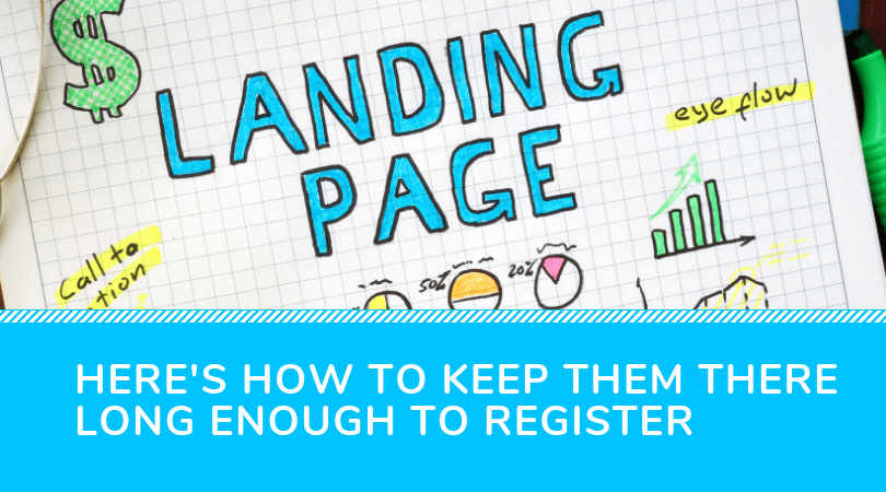
Your customer just clicked on your link to your event landing page. Finally, all your costly advertising efforts have paid off!
Or have they?
Getting your prospects to visit your event landing page may have been a challenge in itself, but you’re just getting started. You now have to keep them there long enough to register.
Don’t fret: if you have been struggling to generate conversions on your event landing page, you have come to the right place. In fact, don’t even waste your time promoting your event before you’ve had a close look at this checklist!
What is an event landing page?
Let’s start with the basics. What exactly is an event landing page?
To put it simply, it’s a web page specifically optimized to generate conversions. Or, in even simpler terms, it’s a page on your website which is specifically meant to collect attendee registrations.
Why is it called a landing page? Because it’s the page potential delegates first “land” on when they click on your ads or affiliate links. They are meant to maximize your advertising budget by condensing your entire sales pitch into one beautifully-designed promotional space.
What are the 5 key event landing page best practices?
You’re now fully up to date with our event marketing agency jargon. So what are these 5 event landing page must-haves that we keep hyping you up about?
Here you have it, our complete event landing page checklist:
1. Stand out with a clever headline
2. Provide plenty of FOMO-inducing pictures
3. Earn your prospects’ trust with social proof
4. Adapt to any type of device with a responsive design
5. Finish it up with a killer call-to-action
1. Stand out with a clever headline
If there is one thing that all the best event landing pages have in common, it’s their catchy, irresistible headlines. Think about it: it’s the first thing your customers are likely to see when landing on your site!
First impressions matter, so make sure your headline is up to par. In fact, take that saying “Never judge a book by its cover” and throw it out the window: in event marketing, potential delegates will judge your book by its cover, its title, and even by the look of its barcode! (and we’re barely exaggerating)
Take some time to think of a clever, memorable, thought-provoking catchphrase which will truly resonate with your target audience. Here are a few ideas to help you get started:
- Clearly communicate your event’s value proposition through your headline: what benefits can your customers obtain by signing up for YOUR event?
- Leave a little something something to the imagination. spark your customers’ curiosity with a cliffhanger
- Why not use a previous attendee’s testimonial directly as catchphrase? This will inspire trust and might spark your visitor’s interest.
Don’t neglect this step: by putting some extra thought into your headline, you can ensure that your prospects’ attention will be all yours for the rest of the landing page conversion process.
2. Provide plenty of FOMO-inducing pictures
FOMO, or Fear Of Missing Out, is also known as the ultimate secret to an effective event marketing strategy. You want your customers to feel like your event is THE event of the year, a once-in-a-lifetime opportunity that they would forever regret not attending. And what better tool to achieve that than through the use of stunning visuals?
If your headline may convince your visitors to stay on your event landing page a little longer, your pictures are what draws them in for good. Whether it’s high-quality shots of your speakers, beautiful photographs of your venue, or fun and eye-catching animated graphics, your visuals can make or break your event landing page.
3. Earn your prospects’ trust with social proof
With a nice catchy headline and a pleasing event landing page design, you’re already halfway there. Now, the time has come to deal with any mental objections your customer may have. To do so, you may want to feature the benefits your event promises on your landing page. But why not go even further and make those benefits come from the mouth of real attendees?
While this may be harder to achieve if you are hosting the very first edition of your event, you can always count on the influence of your partners (whether they’re speakers, sponsors, or influencers) to earn your clients’ trust and, ultimately, their business!
4. Adapt to any type of device with a responsive design
Before we move on to the last step, we must warn you: if your landing page is not already responsive (or, in other words, adapted to mobile devices), you are making a HUGE mistake.
Now that mobile usage has officially exceeded that of desktops, responsive websites are more important than ever. Chances are your customers will find you on their mobiles first, whether they click on a Facebook ad or hear about you from an influencer. So don’t lose precious conversion opportunities with a poor mobile experience!
When looking for an online landing page builder, make sure it offers a responsive event landing page template option. You can also ask your developer to optimize your website for the best mobile-browsing experience possible.
5. Finish it up with a killer call-to-action
The time has come for the final blow, the ultimate landing page conversion-magnet… Your call-to-action!
Your call to action is, like the name suggests, what inspires your customers to take action. It’s your opportunity to tell them exactly what you want them to do, whether it’s signing up for your newsletter or securing a booth at your exhibition.
Here are some guidelines to follow for a great call-to-action:
- Use the words “get”, “join” or “book” rather than “buy”, “sign up” or “submit”
- Communicate a sense of urgency with words such as “now” or “today”. Other examples include “save your spot!”, “enjoy this limited time discount”, etc.
- When appropriate, take a familiar or friendly tone with phrases such as “Join us now!” or “Let’s meet up!” for a more trustworthy call-to-action
- Use FOMO with calls-to-actions such as “Don’t miss out!” or “Find out what all the hype is about!”
- Remind clients of your value proposition with copy such as “Come hear [famous speaker] in person!” or “Get a chance to meet [industry expert]!”
Write as many call-to-actions as you can and take your time before making your final choice. Since this is one of the most crucial factors in determining whether your event landing page will generate conversions or not, you need to be confident. You might even consider running A/B tests to obtain real-life data to back your final decision.
Bonus tip: save valuable time with Snöball’s automatic event landing page builder
While we strongly believe in the power of a well-optimized landing page, we know that event organizers have other priorities. After all, you have tons of things to take care of and manage in order to provide your event participants with the best experience possible, and marketing your event can easily be left out in the process.
Thankfully, you can now save some valuable time with Snöball’s automatic event landing page builder and its perfectly integrated influencer marketing strategy. Book a free 17-minute demo today to find out how we can help you generate more registrations for your next event!


